GearJot · Fleet management SaaS · 0→1
Rebuilding a fleet app around the machine
A problem found in the field reaches the right person automatically. Nobody has to type it twice.


Toma Andrushchak
Senior Product Designer · Warsaw
Work
About
CV ↓
Role
Senior Product Designer, the only designer on the product
Team
Founder, 2 engineers, a marketer. No PM.
Timeline
Dec 2023 – Sep 2024 · 10 months
PROBLEM
A web app from the 2000s with real customers. Its parts were not connected, so problems found in the field had to be typed again in the office.
GOAL
Rebuild the old product so it could compete with modern B2B tools.
WHAT I DID
As the only designer, I reviewed the old app, defined the new product model with the founder, and designed the office web app, the tablet app for operators and the design system.
RESULT
Problems found in the field now reach a mechanic automatically. Service plans itself from engine hours. A new customer’s fleet is imported from their own spreadsheet in one session.
01
Context
An old app with real customers
GearJot helps companies take care of heavy machines: dump trucks, excavators, loaders. For example, at mining sites and large construction projects. Three kinds of people use it. Operators drive the machines and check them before every shift. Mechanics repair them. Fleet managers make sure enough machines are working, so the site doesn’t stop.
When I joined, GearJot was a very old web app, built in the 2000s. It still had real customers and real data, but it was too old to improve step by step.
So we kept the name and rebuilt everything else. The team was small: the founder, two engineers, a marketer and me. There was no product manager.
My job was to help decide what the new GearJot should be, and to design it so two engineers could actually build it.
02
The idea
The old app already had the right parts: inspections, tasks, notes. But they were not connected. My main idea was to connect them, so a problem found in the field becomes a repair task automatically.
03
Where we started
Many small problems, one cause

The old GearJot, as I found it. Customer and people names are blurred.
Before designing anything new, I reviewed the old app and left comments right on the screens. I found many small problems, but most of them had the same cause.
The app was built around sections and records, not around machines. You couldn’t open a machine, act on several at once, or see the main menu inside one. Fixing the screens one by one wouldn’t help. The structure had to change, and this became the starting point for everything else.
04
The new model
People think in machines, not in menus
One comment from the founder changed how I saw the product. He asked that machines look the same in every table: icon, unit number, make and model, and a click opens the machine.
It sounded like a small request for one component. But it showed something bigger. People don’t think “let me open the Tasks section”. They think “what’s going on with truck LT107?” That gave me three ideas:
01
Everything starts from the machine
Tasks, inspections, notes and sensor data are all on the machine’s page. Find the machine, and you find everything about it.
02
A problem should lead somewhere
If an operator answers “No” during a check, the app changes the machine’s status, creates a task and tells the manager. The operator just answers honestly.
03
Same data, different questions
Operators ask “what do I check?”, mechanics “what do I fix?”, managers “what’s stopping work?”. Each gets their own starting screen.
The founder also gave a simple colour rule: grey means not started, red means something is wrong. I used it across the whole app: colour appears only where something needs attention.
05
One event
One leak, start to finish
To keep the case easy to follow, I use one example all the way through: a hydraulic oil leak on dump truck LT107. You’ll see it on every screen it touches, with the same data each time.
7:12 AM · OPERATOR
Answers “No” on a hydraulic check
Jake · tablet
7:15 AM · SYSTEM
LT107 is marked Down and repair task WO-1182 is created
Automatic, no typing
7:16 AM · MECHANIC
Gets the task with photos and safety steps
Derek · desktop
10:31 AM · FLEET MANAGER
Sees the impact on the Today screen
Toma · office
06
What we built
Five parts that work together

1
One place for each machine
Machine list and machine page

2
From problem to repair
Checklists, tablet app, repair task

3
Service that plans itself
Automatic service reminders

4
What needs attention first
Today screen and live map

5
Bringing in old data
Importing spreadsheets
1
One place for each machine
The machine list is where most of the old problems were. Instead of fixing the old table, I rebuilt it: each row is a machine, and a click opens it.

Machine list. Problems stand out, each fleet has a summary, and filters stay visible.
Colour only for problems
Working machines stay grey. Only “Down”, late service and open problems have colour, so you see the two broken trucks first.
Each fleet has a summary
“24 trucks · 1 down · 1 in service” is shown on the group row. A manager knows how the fleet is doing without opening anything.
Retire, don’t delete
Machines that are sold or no longer used are marked Retired, not deleted. Their history stays, and they are hidden by default.


Machine page. Status, service, problems and history of one machine in one place.
Answers first, details later
The top of the page shows what people ask about: hours, use, next service, last check. Make, serial number and other details are lower on the page.
Every problem shows its source
A check, an automatic reminder or a person. You always know where a problem came from and can open the original.
People and the app in one history
What a person did and what the app did automatically are in one timeline. Nobody has to ask “who created this task?”
THE QUESTION
Organise the app by sections or by machines?
OPTION A
By sections
Tasks, Checks and Notes as separate areas, like in the old app. Easier to build.
OPTION B
Chosen
By machines
Everything is linked to a machine and opens on its page. Sections are just different views of the same data.
WHY WE CHOSE B
Every section needed the machine details anyway. Building one good machine component once was cheaper than solving it again in every table.
THE COST
More work at the start. The machine page and the machine component had to be designed and built before anything else.
2
From problem to repair
Checks were the most important part of the app, and the weakest. When an operator found a problem, it became only a note. Someone in the office had to read it and type it into a task.
I designed the whole path: the checklist a manager creates, the check an operator does on a tablet, and the repair task a mechanic gets.

Checklist builder. Questions are grouped by type, and the rules sit right on the question.
Operators do checks on a tablet, not a phone. They wear gloves, work in bright sun and often have only one hand free. So the buttons are big, the edges are thick, and the answers are close to the thumb. The app also works without internet. When the tablet is online again, nothing the operator reported is lost or changed.


Tablet app. Start of shift, one question at a time, reporting a problem, summary.
One question per screen
With gloves and bright sun, a long form means skipped questions and wrong taps. One question at a time is a bit slower, but very hard to get wrong.
Today’s dangers first
Before the first question, Jake sees his machine, the check that’s due and the site hazards for today.
Photos show what OK looks like
A new operator may not know what a “worn hose” looks like. Example photos help different people answer in the same way.

Repair task WO-1182. The operator’s photos come with it.
Photos come with the task
Jake’s photos and voice note arrive with the task. Derek, the mechanic, doesn’t need to call and ask “what did you see?”
AI suggestions are marked
AI suggests it’s probably a seal leak (87% sure), and the note shows who confirmed it. Nobody acts on a guess.
Waiting vs repair time
The task shows how long the truck waited and how long the repair took. Here the delay was waiting for parts, not the work.
THE QUESTION
Should a failed check create a repair task on its own?
OPTION A
Always ask a manager first
A manager reviews every problem first. Safe, but an unsafe machine could wait for hours until someone reads the note.
OPTION B
Chosen
Depends on how bad it is
“Unsafe” stops the machine and creates a repair task right away. Small problems wait for a manager.
WHY WE CHOSE B
The person standing next to the machine knows best how bad it is. The app should trust them and act.
THE COST
More machines stopped by mistake. So “Unsafe” needs a photo, and only a mechanic can change Down back, with a reason.
3
Service that plans itself
The founder asked for service reminders. But every fleet counts service differently: by engine hours, by kilometres or by date. And reminding someone to service a machine that’s already broken makes no sense.
So before drawing screens, I wrote down the rules: what starts the countdown, when it resets, and how early to warn. Those rules became the screen.

Automatic reminder. Service every 250 engine hours, paused while the machine is broken.
4
What needs attention first
A fleet manager doesn’t ask “what’s new?”. They ask “what is stopping work right now?” The Today screen sorts work by urgency: now, today, this week. Each item shows who is working on it and what happens next.
Today. The fleet manager’s morning, sorted by urgency.

Live map. Only machines with problems have colour. Details open right on the map.
5
Bringing in old data
For a new product, the hardest moment is often the first day. Every customer came with a spreadsheet full of short forms and typos, like “N. Yard”, “Wrkshp” or “J. Morrison”.
The import matches columns automatically. Then it asks only about what it can’t understand: add a missing site, invite an unknown operator, or leave a machine without one.
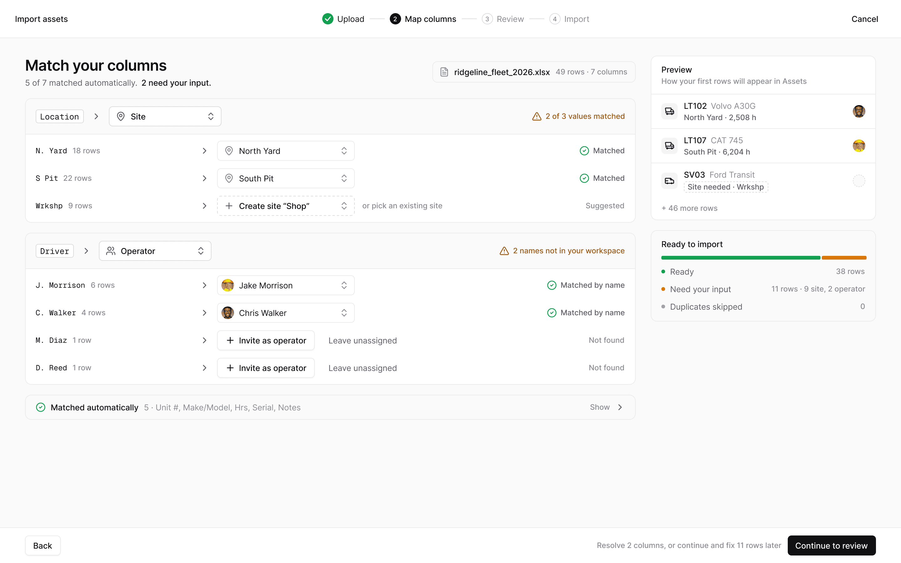
Import. Columns are matched automatically, with questions only where the data is unclear.
Matched where it’s safe
5 of 7 columns match automatically. The questions are only about the few things that a person has to decide.
Ask, don’t guess
Guessing that “J. Morrison” is Jake Morrison would be faster. But one wrong guess puts a driver on the wrong truck, so the app asks.
Nothing blocks day one
Unknown drivers can stay unassigned and be fixed later. A messy spreadsheet can still be imported on the first day.
07
What we didn’t build
The feature we postponed
At one point the founder wanted a full team chat inside GearJot, with channels, direct messages and threads. His reason made sense for sales: an all-in-one tool is easier to sell.
Founder
· Product owner
A built-in chat makes GearJot a complete tool, easier to sell as “everything in one place”.
Me
· Product designer
A chat is months of work for two engineers and delays the core features. Connect to Slack instead, and keep conversations linked to machines and tasks.
OUTCOME
We designed the chat to see how big it really was, then postponed it. Checks, tasks and automatic reminders were built first.
Even in the chat design, every message is linked to the machine it’s about. So if chat comes back one day, it will fit the rest of the app.
08
Design system
A system two engineers can build with
I couldn’t review every change the engineers made, so consistency had to come from the design system: shared colours, text styles and spacing, plus ready-made components for things that repeat, like buttons, badges, the machine chip, table rows and map pins.
The same system has two sizes. A compact one for office screens full of tables, and a bigger one for tablets in the field, with larger buttons and text.


Design system. Colour, type and density, and the components that repeat across every screen.
09
Outcome
What changed
0
manual steps
From a failed check to a repair task. The check creates the task, and “Unsafe” stops the machine.
Auto
service planning
Service plans itself from sensor data and pauses while a machine is broken.
1
session to get started
A new customer’s spreadsheet is imported in one go. The app asks only about what it can’t match.
10
Reflections
What I’d keep — and change
The most useful thing I did on GearJot wasn’t a screen. It was asking the same two questions about every feature: which machine is this about, and what happens next?
What I’d change: we checked most decisions through the founder and his conversations with customers. For a small team this was the realistic option. But the biggest assumptions in this case are about work in the field: gloves, bright sun, one free hand. Next time I would test a tablet prototype with two or three operators much earlier, ideally outside and wearing gloves.
↑
Back to top

NEXT CASE
How we used AI to remove friction inside a complex B2B product
→