
Role
Product Designer
Scope
Onboarding system, UX, motion
Type
B2B SaaS 500+ users
Context
Logic Builder is a no-code platform for building automated customer communication flows without engineering support. Users connect nodes on a canvas to create multi-step conversational logic.
The product was originally built by engineers for internal use, but later evolved into a customer-facing B2B SaaS platform used by non-technical operations and support teams.
As more customers started using the product, onboarding became difficult to scale. New users opened the builder, saw an empty canvas and unfamiliar logic structures, and often didn’t know how to start.
Because of this, almost every customer required multiple live onboarding sessions with the team. Users needed help understanding how flows worked, how different parts of the system connected together, and what they were expected to do first. Some onboarding processes took 4–6 hours across multiple calls.
This created constant operational overhead for the team and slowed product adoption.
My goal was to redesign onboarding into a scalable product system — helping users become independent inside a complex tool without relying on repeated onboarding sessions.
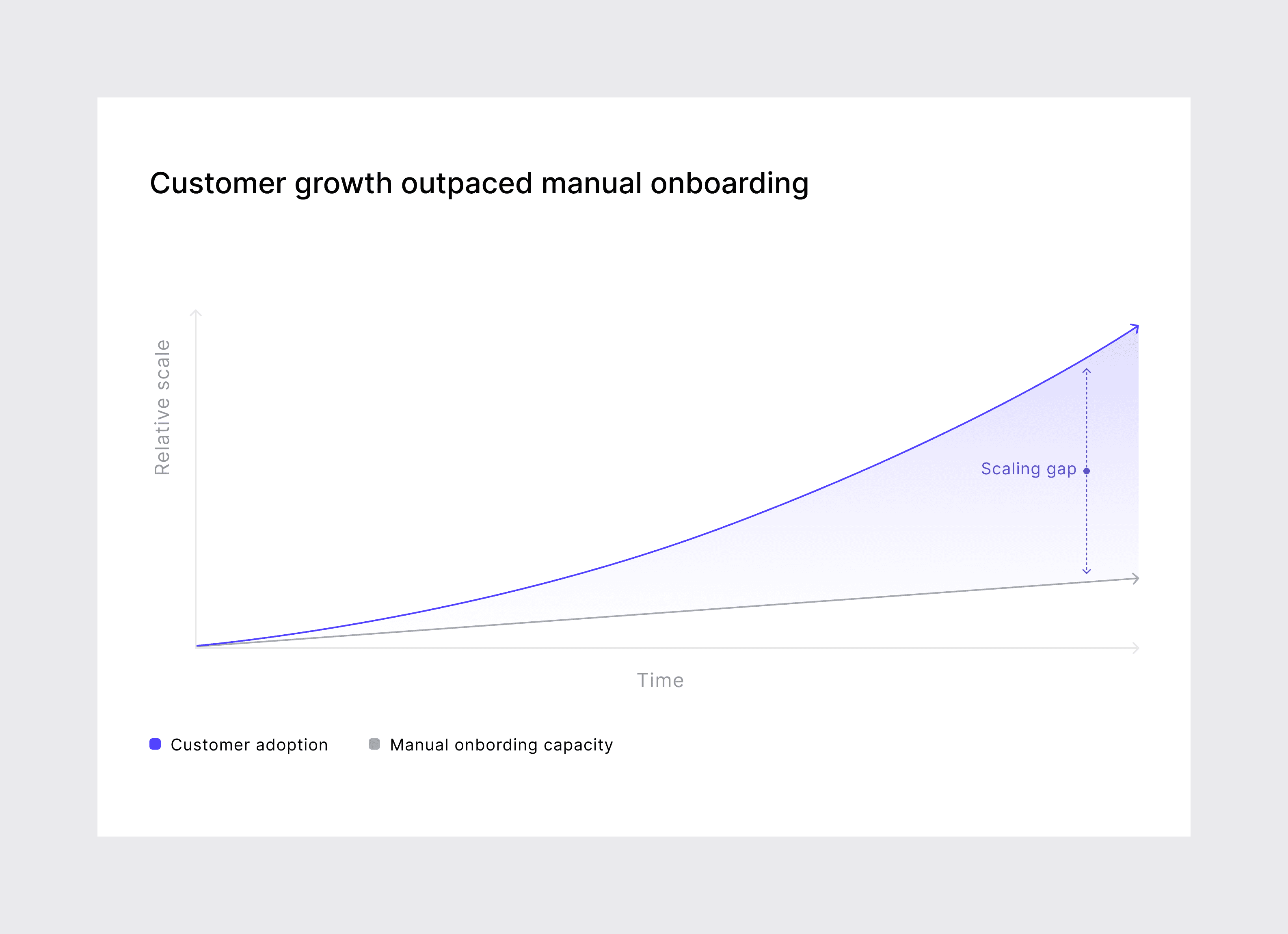
Customer adoption scaled faster than onboarding
Key achievements
+30%
First flows created
during the first 7 days
-50%
Dependency on repeated onboarding calls
-35%
Operational onboarding load on the team
+30%
First flows created during the first 7 days
Based on operations team tracking and product analytics, 3 months post-launch.
Forming the hypothesis
Better-written tooltips instead of voice
Wouldn’t have fixed skip behavior — it’s an attention pattern, not a clarity issue.
AI-personalized onboarding paths
Would hide product structure instead of teaching it. Mental models had to come first.
Generic pre-built templates
Would impose universality across customers with very different domain logic. Letting teams build their own preserved that variability.
Combine onboarding, AI, templates, and voice into one learning system
Reduce structural confusion by teaching the product gradually inside the builder instead of relying on onboarding calls and external help.
What we learned before starting
Before redesigning onboarding, we needed to understand where users were getting stuck and why the team spent so much time helping people learn the product.
To do that, we collected signals from several places.
Where the insights came from
1
Onboarding sessions
Reviewed recordings from 12 onboarding calls with non-technical users over 2 months to identify repeated questions, confusion points, and moments where users stopped progressing.
2
Support requests
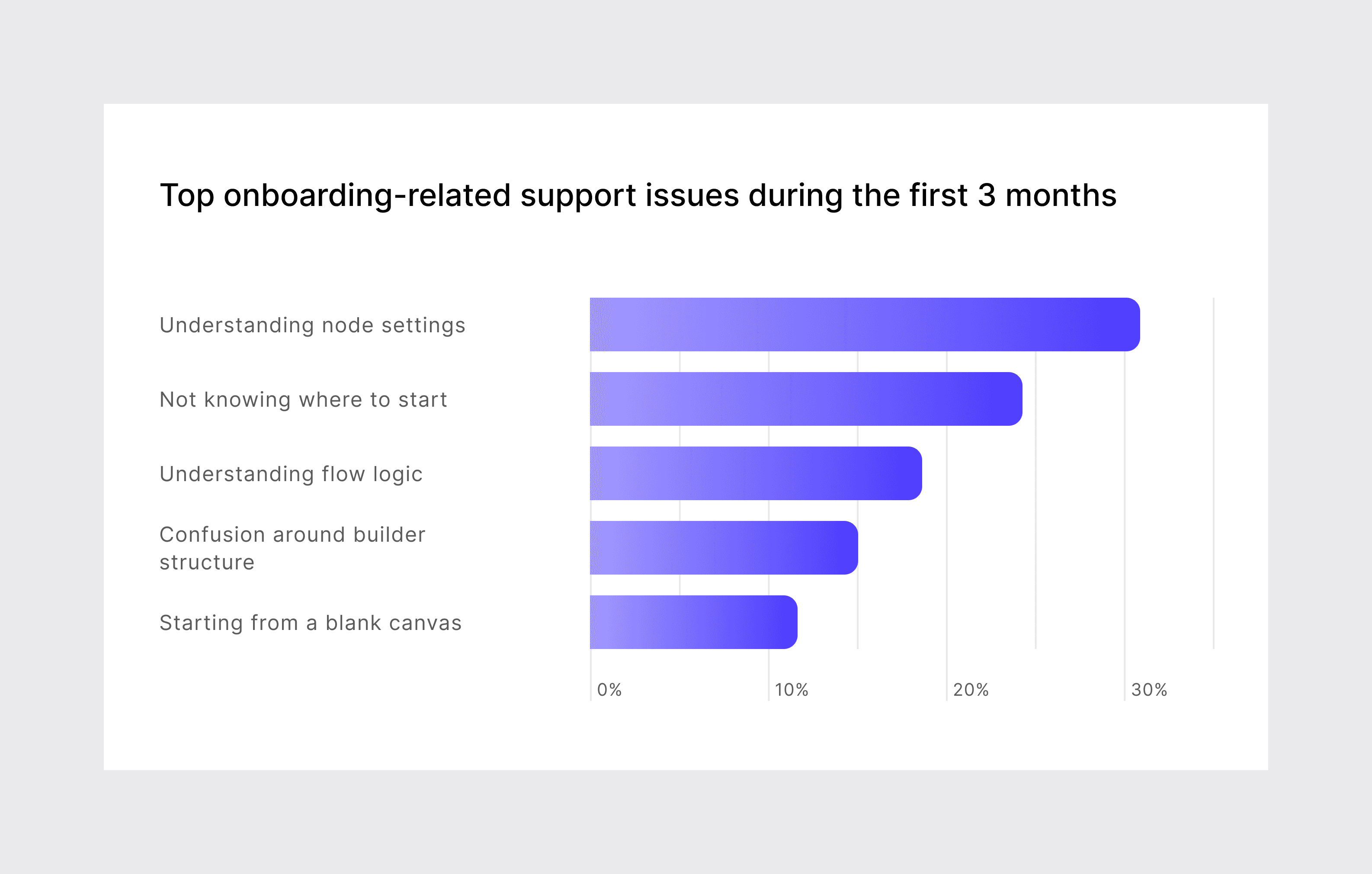
Reviewed onboarding-related support tickets from the previous 3 months and grouped them by recurring problem types.
3
Internal walkthroughs
Asked 8 non-technical teammates to complete simple first-time tasks inside the builder and observed where they hesitated, got confused, or stopped progressing.
4
Competitor review
Reviewed onboarding patterns used by products like Intercom and other workflow-based SaaS tools to understand what worked and what users ignored.
What we found
1
Most problems happened before users built their first flow
Around 70% of onboarding-related support requests happened during the first sessions with the product.
2
The biggest barrier was understanding how the product worked
Users struggled more with system structure and flow logic than with individual UI elements.
3
Technical language created confusion
Many labels, settings, and node configurations were written in engineering terminology that non-technical users didn’t understand.
4
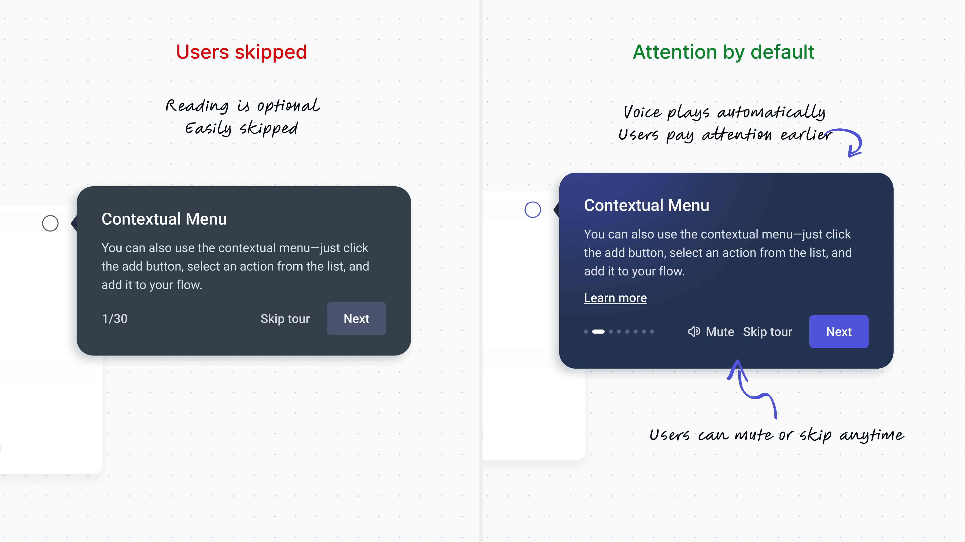
Users skipped text-only onboarding tours
The problem wasn’t clarity — users simply didn’t engage with long text explanations.
How I made decisions
Designing onboarding for a complex product means making a lot of small decisions. To keep them consistent, I worked from four principles:
1
Onboarding is a system, not a moment.
First-time tours decay. Help should exist where users actually need it.
2
Respect the user’s agency.
Users learn differently — by doing, exploring, or skipping ahead.
3
Reduce before you add.
Every tooltip, animation, and label must solve a real problem.
4
The product should teach itself.
If users have to leave the product to understand it, something is broken.
Most of the decisions below trace back to one of these.
What we built
Each decision addresses a different version of the same problem — the fear of starting in a complex product.
1
Simplified confusing config panels for non-technical users
Made node configuration easier to understand.
2
AI voice-guided onboarding
Made onboarding harder to skip.
3
Build with AI Copilot as a starting path
Helped users start without facing an empty canvas.
4
Let teams create their own templates
Made successful flows reusable across teams.
1
Simplified confusing config panels for non-technical users
In usability tests I led, users got stuck the moment they opened a node — not on the canvas itself. The panels exposed system logic using engineering terms and internal structure that non-technical users didn’t understand. Adding tooltips on top wouldn’t solve the problem because the structure itself was confusing.
I rebuilt the panels using clearer labels, grouping, and hierarchy. Boolean operators became business rules, field paths became data sources, and the interface started speaking the user’s language instead of the system’s language.

Option Select node configuration before and after restructuring. Previously, the panel exposed internal system logic that non-technical users struggled to understand. I restructured the layout using clearer labels, grouping, and hierarchy.
2
AI voice-guided onboarding
I broke onboarding into smaller contextual steps, so users got help when it became relevant instead of all at once. Users could choose how to start: guided tour, AI-assisted build, or self-exploration.
The first version used text-only tooltips, but users skipped them. The issue wasn’t the content — it was attention. So I added AI voice narration with a Mute toggle. The content stayed the same, but voice made users more likely to follow the onboarding instead of skipping through it.
Voice guidance wasn’t part of the original scope, and the client didn’t have budget for voice production. I tested AI voice tools, built a working prototype myself, and helped the team ship it without external production.
3
Build with AI Copilot as a starting path
Even after onboarding, the empty canvas was still a barrier. Users understood the system, but many still didn’t know what to build first.
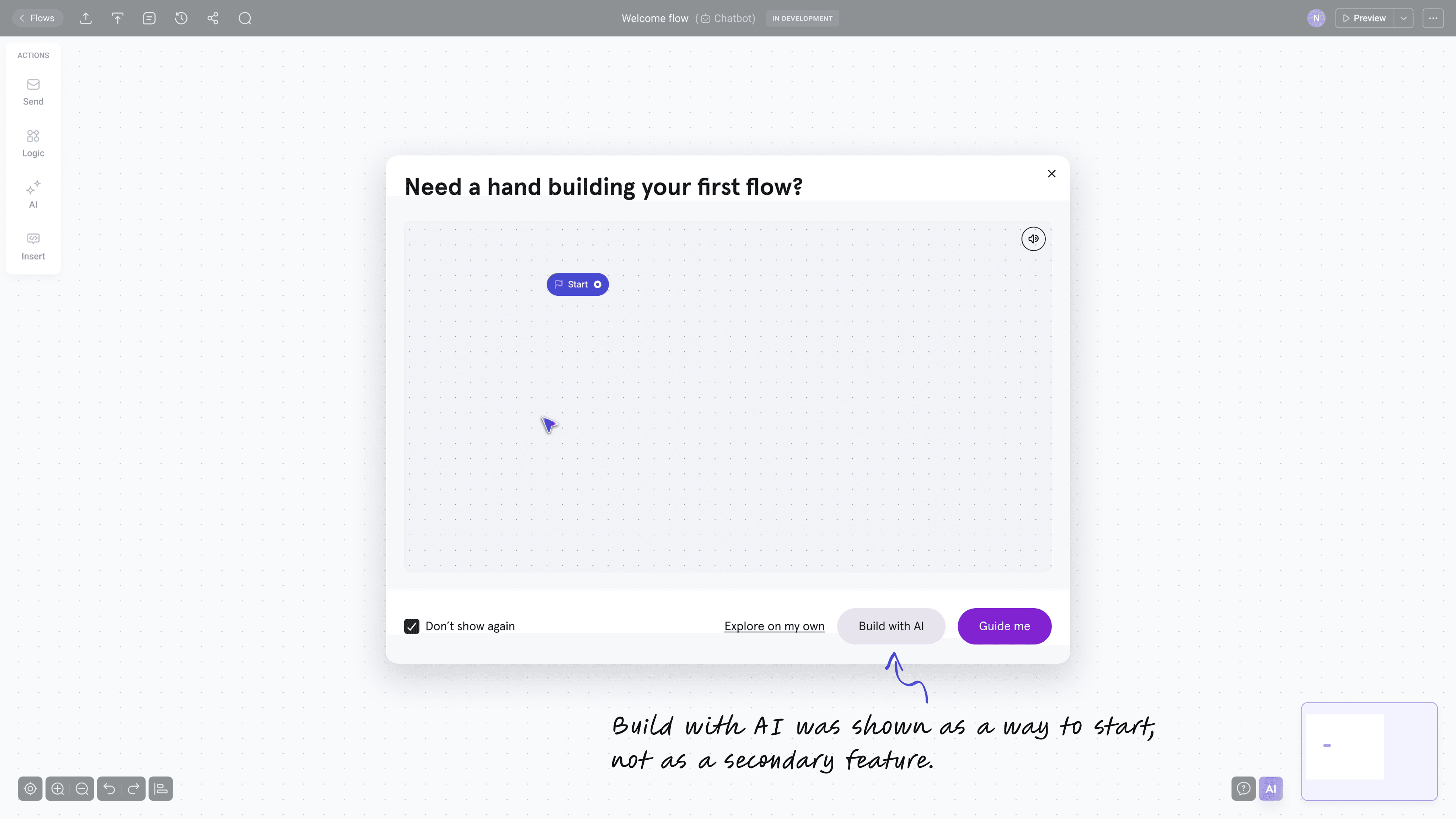
The product already had an AI Copilot inside the builder, but it was treated like a secondary feature. I moved it earlier in the experience and made «Build with AI» one of the main starting options alongside «Take a tour» and «Explore on my own.»
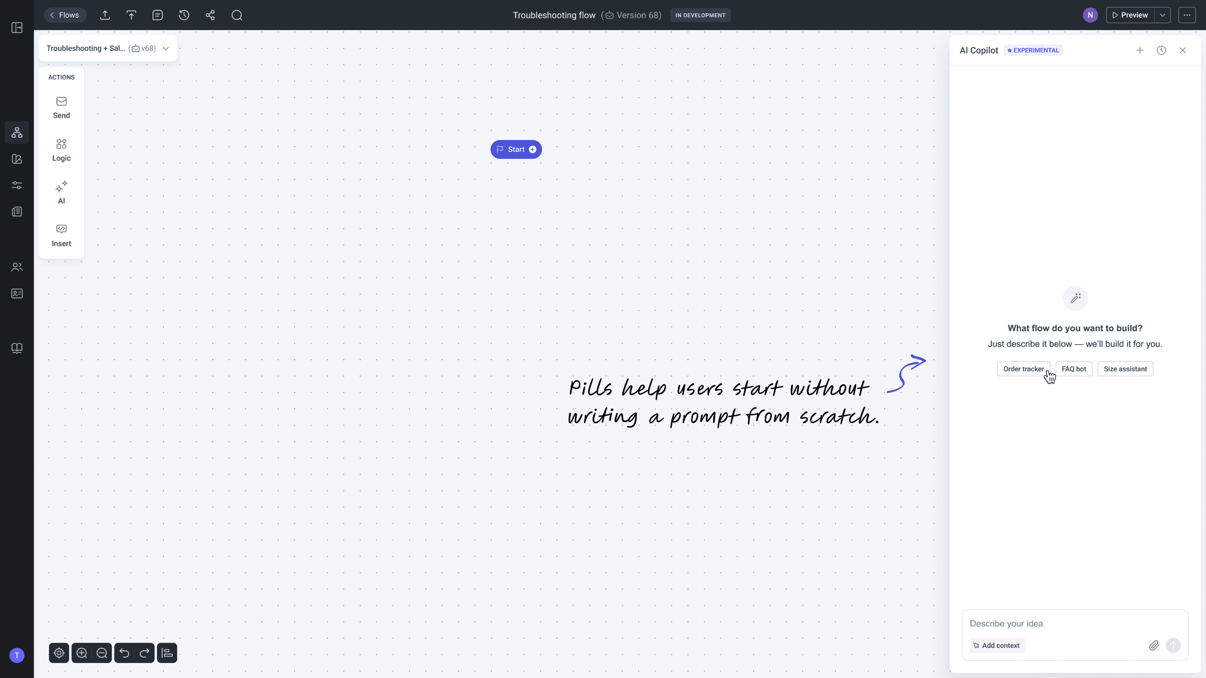
Instead of starting from an empty canvas, users started with something they could edit and learn from.
4
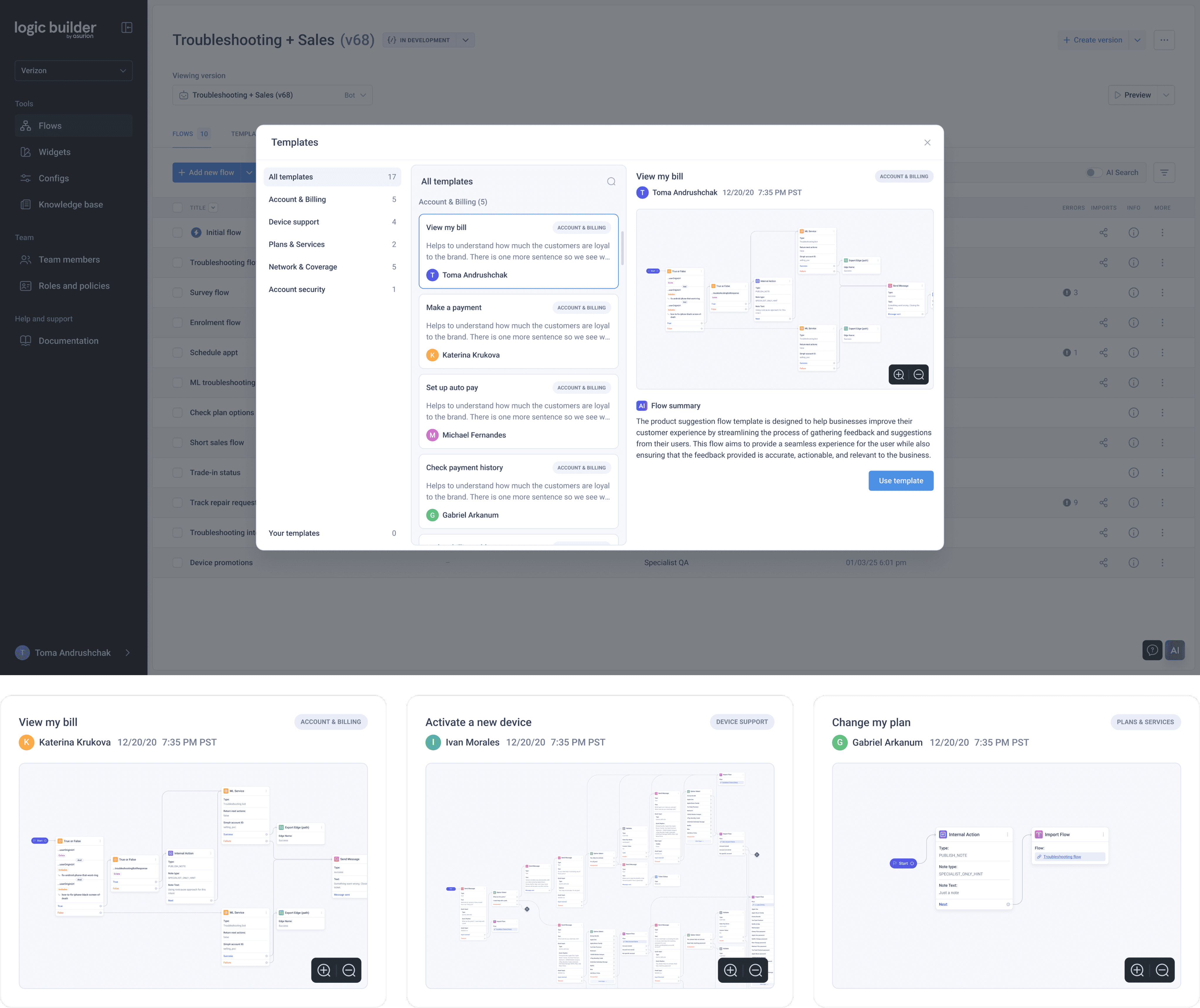
Templates that customers build themselves
The request sounded simple: «add templates.» The real challenge was that every customer worked differently — different workflows, conversation logic, and brand voice. There was no single template that would work well for everyone.
Instead of creating templates for customers myself, I pushed for giving teams a way to create and save their own inside the workspace. One person builds a useful flow, the next person starts from it instead of starting from scratch.
It didn’t solve the first-time user problem immediately, but over time teams stopped facing an empty canvas every time they created a new flow. Knowledge created by one person became reusable for the rest of the team.
Producing the motion myself
Animated onboarding usually requires a separate production pipeline — motion designers, voice actors, editors. We didn’t have that setup, so I built the workflow myself using lightweight tooling and AI voice generation.
I prototyped the motion in Figma, combined it with AI voice and sound effects, then exported everything directly into the product and knowledge base.
The setup turned out faster than a traditional production process. When the UI changed, onboarding could be updated the same day instead of waiting for a full production cycle.
REFLECTIONS
The hardest part wasn’t designing onboarding screens. It was realizing the problem wasn’t a lack of explanations — the product exposed too much complexity too early.
Instead of layering more onboarding on top, I focused on reducing friction directly in the product: simplifying configuration, guiding attention, and helping users start with something editable instead of an empty canvas.
One thing I’d improve in the future is onboarding measurement. We didn’t have clear tracking for where users dropped off, so many decisions relied on observation and support feedback instead of behavioral data.
This wasn’t an onboarding project. It was a complexity reduction project applied where users meet the product for the first time.
Remove the human dependency.
Let the product do the teaching.
Collaboration: Operations team (weekly syncs, 3 collaborators). Engineering (active partners — feature scoping, implementation, and walking me through how the underlying systems worked). Hallway testing across departments. Design decisions: mine, in coordination with the design team.
 CV
CV